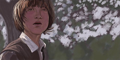
I created this sketch in photoshop today from a screen capture from THE PATRIOT. I am working on some illustrations for the portfolio that are much more dramatic and use different lighting techniques.
I am not particularly happy with the boy's face. I think it looks flat--primarily because there is no light shining directly on the face to provide differences in value--light and dark. It's all about learning though. Stay tuned! I'll be posting some cool stuff soon!
Friday, August 25, 2006
Subscribe to:
Post Comments (Atom)


No comments:
Post a Comment